RESPONSIVE NAVIGATION
Project Overview
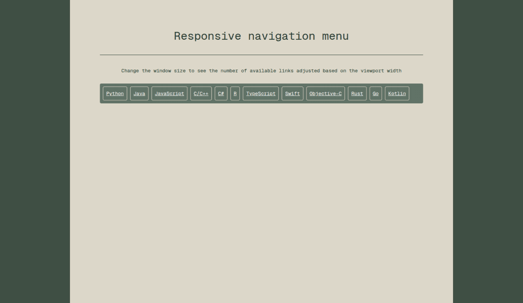
A responsive Next.js 15 navigation bar that auto-measures available width and moves overflowed links into a “More” dropdown. The visible links adapt to the viewport so the layout stays clean across devices.
Tech Stack
- Next.js 15 with TypeScript
- Tailwind CSS for styling
Features
- Runtime measurement with getBoundingClientRect() to calculate each link’s width and the container’s available space
- Runtime measurement with getBoundingClientRect() to calculate each link’s width and the container’s available space
- Flicker-free UX using CSS techniques (e.g., visibility during measure, overflow-hidden, and transition-safe styles) so items don’t jitter while links are reflowed into the More menu